Tools
Notepad
Post-its
Whiteboard & Markers
Google Forms
InVision
Sketch
Photoshop
Keynote
Brief
Three week pro-bono group project for client TechChange. TechChange is an education platform that provides online professional development in technology and social change.
OBJECTIVE
Make an overview dashboard to bridge new students who are increasingly signing up for multiple classes, from the sign in to the individual course pages. Find the best way for students to navigate between courses and vital information.
Challenge
Define what kind of content needs to be in the overview dashboard. How can the overview dashboard compliment the prototype course pages provided by TechChange. And what ways will the current user flow will have to be change to be more efficient.
Methodology
Competitive analysis, User Interviews, User Survey, SCRUMM, Design Studio sessions, wire flows, developed personas, Task analysis, User flow, modular
Process
Getting Started
In order to evaluate what needed to be improved to make a new user experience for TechChange Students, it was important that we understood what was already there. Finding out what kind of offerings the platform has and understanding what kind of experience TechChange students currently go through.
Students Courses were mixed in with the rest of the catalog of courses of TechChange
Students had a lot of navigation paths through the platform
TechChange courses were primarily taught via internal online content (videos, presentation slides, charts, documents etc.)
Research & Analysis
User Surveys were conducted online via Google Forms. Resulting data provided us with the direction needed to define the content of the dashboard.
Notable Survey Queries
What was important to a student in an online dashboard?
What task were you signing on to the site to do?
What about the class were you most likely to forget?
What items were most expected in a dashboard?
Dashboard items least helpful/used
Take Aways
A comprehensive dashboard can often be overwhelming and difficult to parse
Students almost always signed on just to work on the current/next assignment
Students refer to and expect to be able to seek instructor assistance in some manner from the dashboard
Assignment Due Dates ranked as the most likely forgotten detail to students
Calendar Events came in a close second for forgotten details
Activity feeds were a low priority for many
Competitive Analysis
Ideation and Experimentation
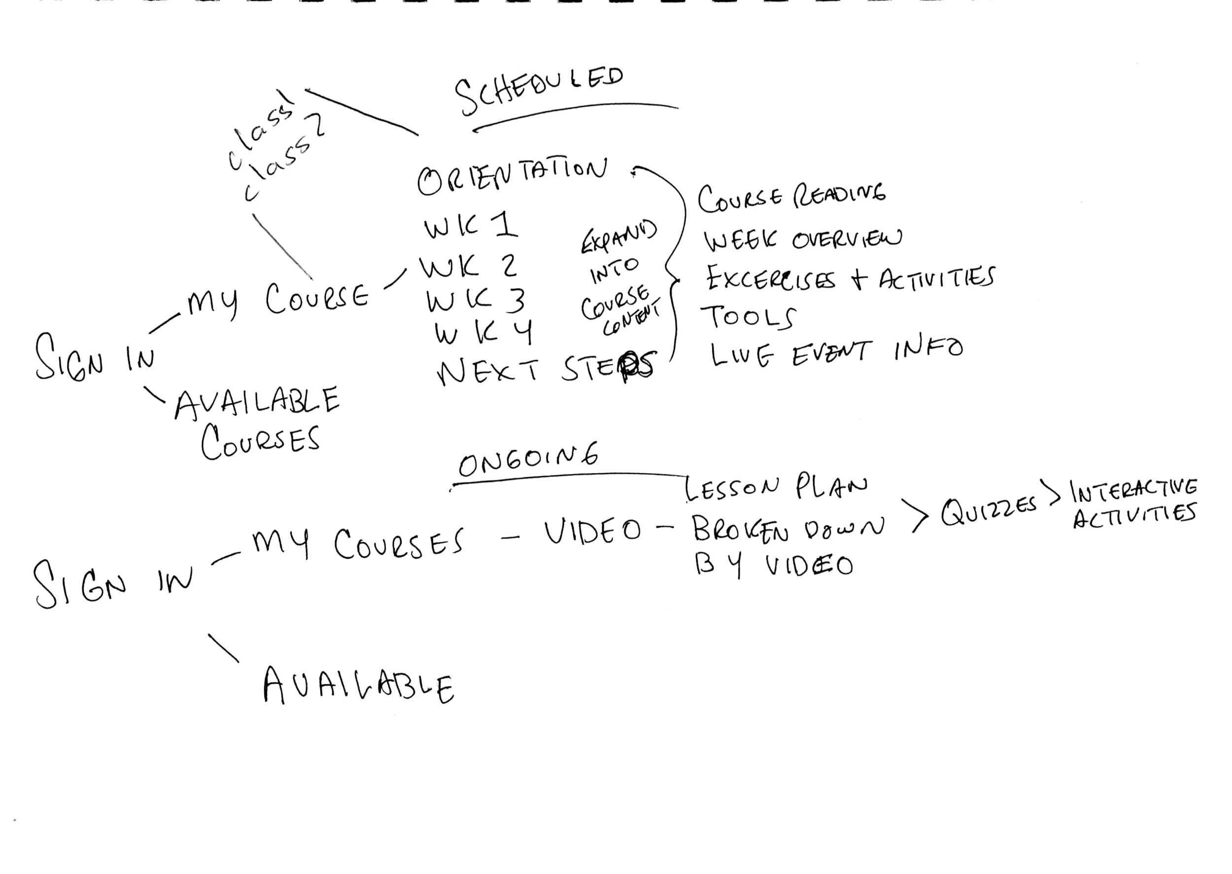
Sketching
Prototypes & Testing
Initial Prototype
Course Card Filter Sidebar
People Sidebar (to contact instructors and teammates
FINAL PROTOTYPE
for new features
Revised filters
The course card filters were redesign to function as drop down menu selections at the top of the dashboard. They were displayed in a thin horizontal layout, which benefitted the rest of the dashboard by giving the course cards more room to be bigger. Also giving the content in each course card visually more room to breathe.
Master navigation
Simple navigation bar to provide 3 core functions.
Access to calendar
Access to notifications
Access to account profile and settings
Ability to serve as an escape hatch back to the Main Overview Dashboard from anywhere on the site.
Revised Course Cards
With feedback from the initial testing. More visual contrast had to be established. Cards were able to be wider since the new filters didn't take up vertical space on the dashboard anymore.
Only two assignments per card
Only two events per card
Color Coded by Sponsored Organization (if applicable)
RSVP/Open Event Notifier
Calendar Modal
We went with a split view design to convey calendar events to the user. Which proved to be successful in user testing.
Month View to communicate visually how upcoming activities fit their current life
Item Listing to give a quick rundown of what 8 calendar events are coming up
Success
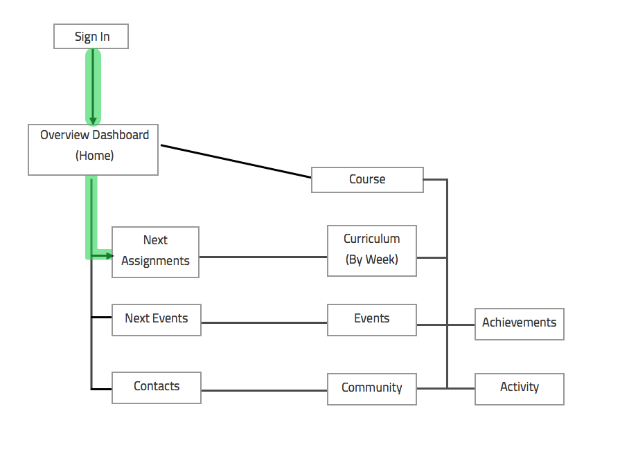
A new faster user flow.
New user flow benefits vs Previous User Flow
With the new dashboard. Students are given shortcuts to their assignments and calendar dates most relevant to their progress in the the course. Previous methods before the implementation of the new dashboard meant that students would have to navigate through several steps and pages before they could get to the class assignment
Most relevant items first
"Next assignment" on surface level
Less clicks and navigation
Get right to work faster
No need to path through the individual course page to work on the current assignment.
2 step flow
Future Roadmap
Integrate TechChange’s revised TechPoint progress system into overview dashboard
Market-test with actual TechChange Students
Establish refined relationship with final course dashboard with our Overview dashboard
Gather data from TC students to see what should be changed/removed/added
Find a way to market related/complimentary courses to students


